This article first appeared in Document 15
Oct 15, 2015. An entire village of Grade 1 listed buildings in an inaccessible location may seem an unlikely location for a music and arts festival, but for Festival No. 6 (Best New Festival 2012, Best Small Festival 2013 & 2015, Best Line-Up 2014 etc) the style, history and character of Portmeirion in North Wales are key to its appeal.
Portmeirion is the brainchild of the architect Sir Clough Williams-Ellis, who scavenged the camp eccentricities of Britain’s crumbling stately homes to build this folly in the style of an Italianate village between 1925 and 1975. “He’d been to Portofino in northern Italy and thought, this is what North Wales needs!” exclaimed Jon Drape, underlining the continuing oddity of the place.
Portmeirion has always attracted culture and art – Noël Coward escaped the blitz to write Blithe Spirit here; George Harrison used it as a film location and the setting for his 50th birthday party – but it will forever live in popular culture as The Village in Patrick McGoohan’s 1960s TV series The Prisoner – the festival’s name a direct reference to McGoohan’s character: Number Six.
Design is an important aspect of the festival experience, particularly for a small festival whose growth potential is severely constrained by geography. Festival director Jon Drape – also known for Manchester’s Parklife and numerous other high profile events – came to Design Manchester’s Music How event with No. 6’s head of arts and culture, the Guardian writer Luke Bainbridge, to submit to questioning by Katie Popperwell on the general theme of design and music.
With the heritage of Portmeirion and the identity of The Prisoner reflected in the themes, signage and graphics, design is central to how the festival is positioned – and this extends to how it celebrates Welsh culture, with popular performances of a male voice choir and bi-lingual signage. “That engagement with Welsh culture, Welsh business and the local community are so important,” says Drape. “The festival wouldn’t happen unless it was authentic. We’re still here after four years because of that.”
Beyond this, festivals are about designing experiences. Bainbridge described how 3D sound was used to design a unique experience in the screening of Kevin Allen’s 2015 movie of Under Milk Wood: “We screened it in the piazza, the main hub of the village, and we got Martyn Ware (Heaven 17, Illustrious) to translate the film audio into 3D. We had 35 speakers around the whole piazza. That was a world première, it’s never been done before.”

A broader cultural perspective remains the focus. “With No. 6, we’re always keen that it shouldn’t be just about the headline acts,” Bainbridge emphasised. “It should be more about the whole experience. We’re getting to the stage where people know that they’re going to have a magical weekend – and the headliners are almost a bonus.”
Not that the headline acts are insignificant – and among the most popular were New Order, whose Stephen Morris was Popperwell’s examinee for Part 2 of Music How.

Clockwise from top left: Stephen Morris, Katie Popperwell, Luke Bainbridge, Jon Drape. Photo © Sebastian Mathes.
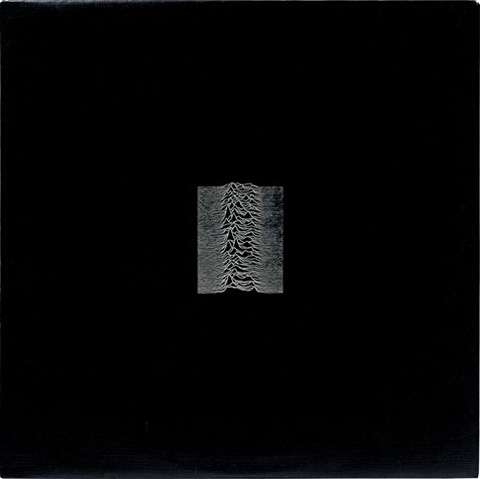
Design – and more particularly the record sleeve designs by Peter Saville – have been part of the Joy Division / New Order story since the release of Unknown Pleasures in 1979, which Morris explained had started with Bernard Sumner “skiving off work in the library looking at pictures”, where he found the pulsar image and showed it to Saville, who loved it, reversed its colours to a spectral white out of black and created a stylish layout. “The thing about Peter,” said Morris, “is that he will always take something from you, even though you probably don’t know what it is at the time. We are involved, in a funny way.”

Joy Division – Unknown Pleasures
To Morris, the physical packaging is an important part of experiencing music and the resurgent appeal of vinyl is welcome. “There is an appeal about a 12” record sleeve that something small on a computer, or even a CD, hasn’t got.” A CD is there to be abused, and streamed music means you listen only to what you like straight away without the album experience of learning to love things that do not instantly appeal. The 12” record is something precious you look after and its look and feel define you and your relationship with the music.
Popperwell noted that Saville’s clean modernist design approach was a radical departure from the fanzine aesthetic so prevalent in the late 1970s. “Now it’s everywhere but in the early 1980s it was very surprising,” Morris agreed. The Tony Wilson / Factory approach, though, “wasn’t an attempt to make a myth, it was an attempt to define something. It was industrial art, I suppose because it was from Manchester. The record sleeve should be a thing of beauty. From the very beginning we didn’t want to put four ugly mugs on the front, we wanted a lovely design.”

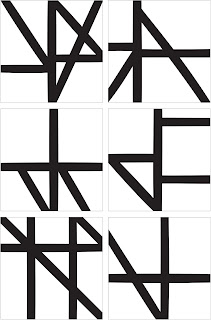
New Order – Music Complete
So what, enquired Popperwell, was it like working with Saville on the beautiful sleeve and packaging for the new album, Music Complete?
“What happens is you go for dinner and you say: ‘Peter, we’re doing a new record and we were wondering whether you could do the sleeve?’ ‘Well, I don’t really do record sleeves anymore. I’m an artist. I do art.’ ‘Fine, OK, we won’t trouble you, we thought we’d ask, out of politeness more than anything…’ ‘I have got an idea, though.’ ‘Right, OK, let’s see your idea.’
“It’s kind of a little dance you have to do with Peter. And he did actually come up for the first time with something that didn’t change too much, and we thought, yes! Maybe because he had a good name for it, which was Techno Tudor. It’s basically Tudor architecture. It was originally in very vibrant colours, the lines with very acidic colours.”

The book included in the package features numerous black and white variations on the theme. Is it, asked Popperwell jokingly, a colouring book?
“What’s missing is the little numbers! But no, I can tell you, that’s deadly serious… ‘Stephen, it’s playful on the outside, but when you take it out, it’s stark, it’s deadly serious. You can see the Tudor buildings straight off.’ ”
“Peter said about that sleeve: ‘That’s Peter Saville, not trying!’” Morris recalled. “You should see him when he tries. Wow!”


