
The first ever creative collaboration between Kasper de Graaf and Malcolm Garrett – the October 1981 edition of New Sounds New Styles magazine – is featured in an exhibition opening at Nottingham Contemporary on 21 September.
Still Undead: Popular Culture in Berlin Beyond the Bauhaus is part of bauhaus imaginista, a project developed by Haus der Kulturen der Welt (HKW) in Berlin to mark the centenary of the Bauhaus art, design and architecture movement.
A major exhibition, which opened at HKW in March and moves to Bern in Switzerland this month, was curated by Marion von Osten and Grant Watson, who also co-curated Still Undead with Nottingham Contemporary’s Sam Thorne. A book, titled bauhaus imaginista and edited by Von Osten and Watson, was published by Thames & Hudson. New Sounds New Styles is featured in the book and both exhibitions.
Both the Nottingham and Bern exhibitions continue until 12 January 2020.
@Nottm_Contemp @bauhaus100 #bauhaus100
————————
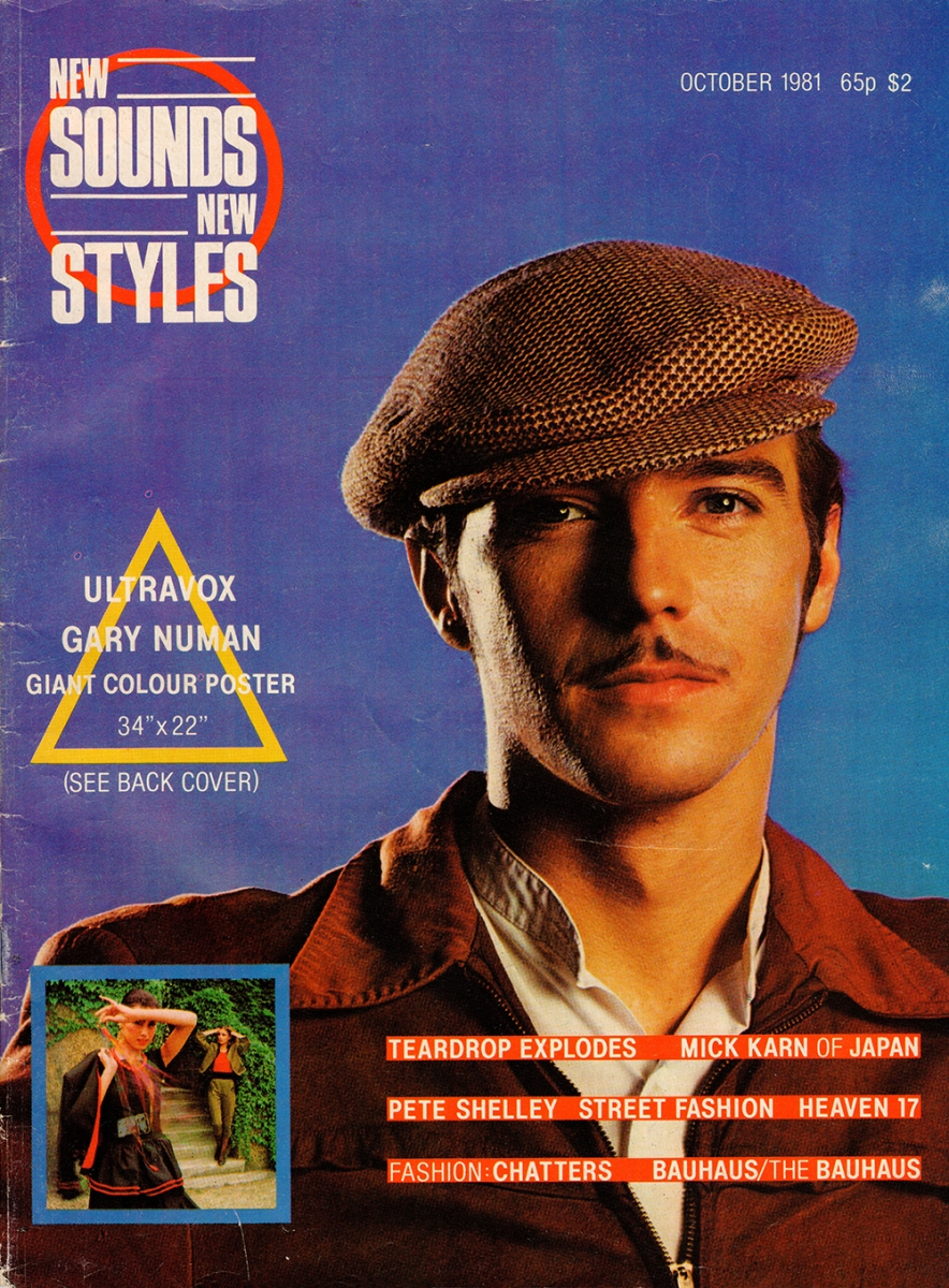
In the dying days of 1980, when I was production editor of Britain’s bestselling pop magazine Smash Hits, I pitched to our publishers that we should create a new magazine focusing on the music and style culture that was emerging in clubs up and down the country, from Birmingham’s Rum Runner to Crocs in Basildon, the Tanzschau pop-up in Cardiff and the Blitz club in London. EMAP agreed and in March 1981 we published a pilot, calling the magazine New Sounds New Styles as a nod to the lyric of Steve Strange’s Visage.
From the start, the approach of NSNS was to be part of that culture, not to stand outside and pontificate. It was a mainstream platform for the bands, the clubs, the artists and designers, even the other magazines. To underline that approach, the pilot issue carried a “guest spread” written and designed by i-D magazine, another new kid on the block that became the bible of “bottom up” street style. When we progressed to monthly publication in July 1981, we showcased the fashion designers whose influence was seen in the clubs: Kahn & Bell and YaYa! in Birmingham, Melissa Caplan and Stephen Linard in London. I hired the young Robert Elms, a writer in the London club-scene tribe that had formed around Spandau Ballet, to edit Avant, a section with a curated diet of new bands, playlists and influences. When the Brixton riots erupted and the mainstream media were full of outrage about smashed windows and looting, we devoted an issue to the sounds and styles of Brixton.
Visually, however, magazines were not part of the culture. The more they tried to differentiate, the more they looked the same. Some louder, others more restrained; some brash, others respectable. Of our peers, Blitz was a true indie, well designed and looking like a proper magazine. i-D was infused with a fanziney anti-style that suited its character. Smash Hits looked poppy and had flair, but in structure and appearance it was not far removed from contemporaries like Kerrang. The Face was well enough designed, but in its early incarnations its design was closer to the continental style of Paris Match than the popular culture it covered.
That culture was influenced by the art schools and framed by the canon of mostly modern and postmodern art and design movements: the Situationism that inspired Croydon Art School students Malcolm McLaren and Jamie Reid to create the slogans and images of punk, the Constructivism of Malcolm Garrett’s Buzzcocks and the Klimt Secessionism of Alex McDowell’s Siouxsie & The Banshees. This was not entirely new. Pop artist Peter Blake had designed Sergeant Pepper. Bowie’s Berlin period was famously influenced by Egon Schiele. But the role of designers and the nature of design in popular culture was changing. Hipgnosis, Roger Dean and Jamie Reid did not just design record sleeves for bands. They created – over multiple albums and phases – the visual language that represented Pink Floyd, Yes and the Sex Pistols to their fans as much as the music, the fashions and the attitudes. Malcolm Garrett took a step further and treated the record sleeve not as a canvas but a three-dimensional product with a front, back and spine, an inside and an outside, all elements a graphic designer could challenge and explore just as the musical artists were challenging and exploring established attitudes. The record sleeve was not just a container to sell the record. It was a desirable item in its own right. Peter Saville picked up with Joy Division, creating designs with beauty and elegance that redefined ideas about punk and Manchester, full of cues for students of art and design to interpret. Saville and Ben Kelly brought that industrial product attitude into the wider context of Anthony Wilson’s Factory Records and Haçienda nightclub, inspiring and creating opportunities for a whole new design-conscious generation. Design history and design innovation were at the heart of 1980s club and music culture. A magazine that was part of that culture needed to be on the same journey. More than that, it offered a medium where that could be explored in exciting ways.
Who could help set us on that path? One of our feature writers, Laura Hardy – then Howard Devoto’s girlfriend – suggested I talk to Malcolm who, like me, had been working with Duran Duran for some time but our paths had not yet crossed. Malcolm got it and was immediately on board. Our first collaboration told that story as eloquently in design as in words and pictures, taking as its cue a feature I had commissioned Jessamy Calkin to write about the band Bauhaus.
Over the next nine months NSNS developed editorially and visually as a vehicle for knowing cultural innovation, evolving as a peer alongside the bands, the fashion designers, the photographers, artists and writers to whom it offered a platform. Writers like Jessamy Calkin, Alex Sharkey, Dave Rimmer, Paul Simper and David Johnson had opportunities to try new ideas. Photographers Derek Ridgers, Paul Edmond and Panni Charrington explored the zone between cultural reportage and art photography. Malcolm’s loose collective of freelance designers and collaborators working under the Assorted iMaGes banner evolved into a solid team of regular designers and illustrators all working on the magazine: Roger Cleghorn, Steven Appleby, Garry Mouat, Joe Ewart.
When the Pope visited Britain, we drew a link between Pop Art and “JPII, Godfather of Soul” in the Pop Issue. The design inspiration for Buzzcocks’ A Different Kind Of Tension was obliquely referenced with a feature on Constructivism in the issue that offered Pete Shelley’s solo song Qu’est que c’est que ça? as a cover-mounted flexidisc. Typographically we made references to the great art magazines of the 1920s but developed a distinctive language for the 1980s. Malcolm’s practice of mixing typefaces within coverlines was memorably described by our (and Smash Hits’) ad manager Rod Sopp as “just a way of using up all the old sheets of Letraset lying around the office”.
Through most of 1981-82, i-D, The Face and New Sounds New Styles achieved similar sales ranging between 30,000 and 50,000 copies a month – respectable by the standards of some magazines but underwhelming to EMAP who, selling a quarter of a million copies of Smash Hits every fortnight, had come to expect more from the youth market. Cultural experimentation was of no interest if it did not sell copies or ads. What NSNS was not doing, as far as they were concerned, was capturing the mid-teens girls readership when it was ready to move on from Smash Hits, and so in July 1982, after 13 issues, they pulled the plug on us and started preparing to fill that gap a year later, very effectively, with Just Seventeen.
The breakthrough came four months later, in October 1982, when Boy George and Culture Club performed Do You Really Want To Hurt Me on Top of the Pops and the “new romantic” club scene went mainstream. It was too late for NSNS, but that was when The Face and i-D found a larger market.
Neville Brody’s design and art direction deservedly went on to play its part in making The Face synonymous with the 80s style revolution, fully a part of and participant in the culture on which it reported. The irony is that Neville was already working on that magazine when I had my first meeting with Malcolm in late July 1981, but his editor, Nick Logan, did not give him free rein to break out of the prevailing orthodoxy of magazine design until much later. Paul Gorman in The Story of The Face (Thames & Hudson, 2017) writes: “As noted by British graphics authority Rick Poynor, Brody's breakthrough in formalising a contemporary design language at the magazine was cemented with the publication of issue twenty-three in March 1982”. Nick Hayward (June 1982, coincidentally the month before NSNS ceased publication) was Neville's first cover.
Brody did not copy what we had done, but he was freed from his shackles. He walked through the door that was opened by this issue of this magazine: the Bauhaus edition of New Sounds New Styles in October 1981. The rest, as they say, is heritage.